Why Website Storyboarding Is Important

After completing the website brainstorming process, you have found a solid topic and sub-category niche. It is now time to start your storyboarding process.

Why create a website storyboard?

While the definition of storyboarding is the sequence of drawing representing shots for production. We can incorporate the same idea in web design.

Website storyboarding will make the design process easier and more efficient. This will save you time, which will save money. Storyboarding a site will help you visualize the result of your project.

Website Storyboarding

When thinking about some building blocks, get a sheet of paper and start to draw your website. Start with the homepage, the homepage is one of the most important pages. You have 5 seconds to attract your visitor your site. If your site is too hard to use, nobody is going to stay.

Make it simple. When you have completed the first storyboard, try to think like a first time visitor. Would you stop and leave? Or would you click on a link? If you would click a link, then you have a great storyboard design.

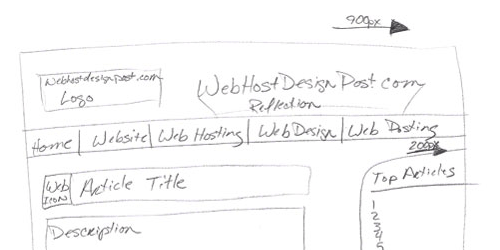
You can quickly draw a quick sketch of a storyboard in seconds.

Here is a storyboard example:
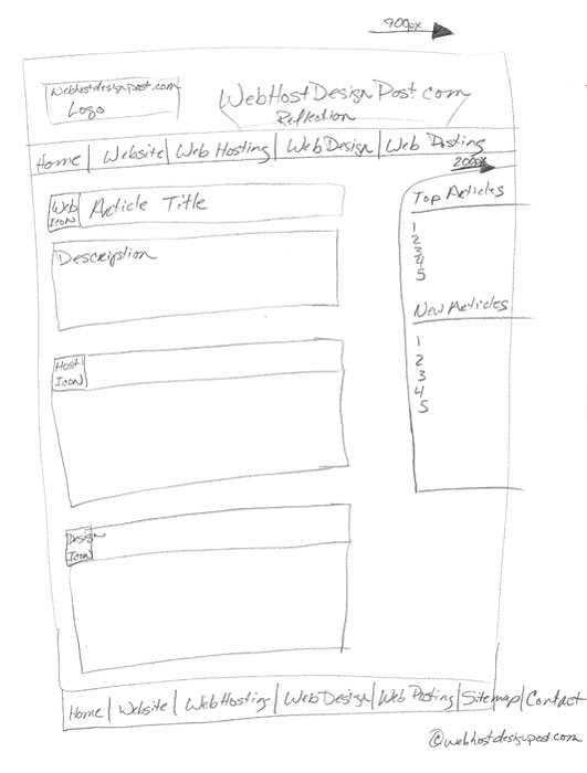
Website Storyboard

Storyboard Your Design & Usability

When you storyboard you should have one statement in mind. How can I make this design stand out and be simple? You want your design fresh and exciting, on the other side you want it simple and very user-friendly.

Surfing Is Not a Waste of Time

Cat Surfing Computer

One way to get some ideas going is to surf the internet. Find web pages that you like and ones that you hate. When you find a great design that you like, ask yourself why? Why do you like this web page? Does it look good, do you like the colors, or maybe you like how clean and organized the navigation is?

Whatever you like about that site, write it down. Always document your ideas and thoughts. It would be sad if you forgot the greatest idea ever.

Now the bad web pages, is it hard to read, navigation, usability or is it another flash site that has cool animations but doesn't have any purpose to it. This is your stop sign list so you don't make the same mistakes.

Keep Consistency
Keep It Simple Stupid

The next page on your site will be easier, remember to keep the pages consistent. Don't change your navigation between pages or the layout. Find a place to put your header, navigation, columns, footer and leave them there. KISS it. (Keep It Simple Stupid).

When you have a couple of pages, pick one. Say to yourself, if I was here, how would I get back to the Homepage? Maybe you are on the homepage. How would I get to one of your content pages? Set up simple scenarios to take yourself through. Make it as simple as you possibly can.

Build a Sitemap

When you have an idea of what your site is going to look like you can take it further and make a sitemap or a site outline. A sitemap is a breakdown of the pages your website is going to include. You start from the home page to the category pages and finally the sub-category pages. Just draw simple boxes to represent the different sections and pages of your site.

A Simple Sitemap Example:
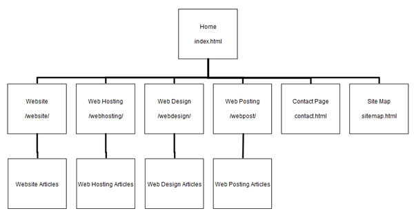
Simple Website Sitemap

This Technique Saves Time

When finding out how to storyboard a website. This method can save you a lot of time and money. It takes a few minutes or even seconds to draw a storyboard up. If you were to develop the code for it, it could take you hours. You don't need to make these sketches look like your are directing a movie.

Take your time and really think about it. Storyboarding it could make your website very simple, enjoyable and become successful. Not doing it could cause confusion, frustration and not be successful.

Remember Keep It Simple

Share

Rating: 
3.4 (12740 votes)

Comments (67)

Comment: 
thanks so much...i hope i get an A...designing a Educational Children Website
Comment: 
Good luck!
Comment: 
This is great! Short and easy to follow advice, and easy to implement. Thanks!! :-)
Comment: 
Merry Cristmas!!!!
Comment: 
Spupertastic! Very easy to follow
Comment: 
WOW! thank you so very much, I have created websites before, for class assignments and when asked to create a storyboard I was overthrown with confusion and this page just made things crystal clear for me. I know understand how to go about creating a storyboard for my website. Thank You!
Comment: 
I'm glad I could help.
Comment: 
I love the content of this site, but the grammar and omitted words leave something to be desired. Example: "You have 5 seconds to get attract your visitor your site." or: "...has their font size higher than normal, then the design might incorrect." These are just readability issues and have no real bearing on the excellent content, but it does stop the flow and beg the question: Did you proofread this before uploading it?
Comment: 
Thanks for the help!
Comment: 
People that build website don't realized how important that site maps are. YOU HAVE TO HAVE A SITE MAP
Comment: 
It does help a lot.
Comment: 
Hi there! Just want to say hi everybody and good day. Thanks
Comment: 
thanks for this usefull information on sitemap.
Comment: 
Thanks for such a nicely written and for your nice cooperation with us. You have filled me with ocean of knowledge. Your article is very useful one. Successful websites are based upon well-thought out plans. Website storyboarding help you identify potential website structure and flow problems before you start spending big money on the programming.
Comment: 
I 100% agree with you.
Comment: 
Hey thanks for sharing such a fabulous ideas. It is fantastic ideas to create web page through the story board techniques. I Love your it, the techniques would be really useful to web pager programmer to design web page on certain time and also for those, who making a plan to hosting an own website. Storyboard technique would be support the unnecessary expenses.This is rally fantastic.
Comment: 
I'm glad you liked it.
Comment: 
Great tips; especially surfing the net for inspiration in order to get ideas. You can learn a lot by taking a look at other sites and seeing what works or not.
Comment: 
tnx a lot ;)
Comment: 
Your tips are very useful. I like your idea of using a storyboard techniques. This drives home the fact that a lot of thought and care should go into planning the website instead of simply jumping in and let the chips fall. The storybook will save time and money if we do not have to change things after the fact. Thank you for sharing.
Comment: 
thanks a heap! i have to do this for an assignment and i had no clue. this website helped heaps!
Comment: 
Good luck on your assignment.
Comment: 
I like your storyboard techniques. which better for first step. I was looking for this kind of information. Please continue writing….
Comment: 
All websites should have a good sitemap, it's not only great for search engines but also leads users whom are lost in your site.
Comment: 
I'm glad you brought up both users and search engines, which are both equally important.
Comment: 
Hey! Your storyboarding technique has helped me a great deal. Thank you very much for sharing your knowledge.
Comment: 
There are some great ideas for creating Web pages through the techniques of story-board. I like your computer techniques would be useful for web programmer locator website design time and also for those who made a plan to host a clean room. The technical support is useless script expenses.This fantastic rally. at last one important thing which i think is very crucial before building a webstie ... why is 900px instead of 960.
Comment: 
That is what I originally thought I wanted my width to be.
Comment: 
That's how I always do my websites. I draw what I wish the site to look like then show it to my designer, then have the design coded.
Comment: 
With the site map, you can actually see how your pages are linked which is very important.
Comment: 
yeah that sure.. site map is very important for completely web design
Comment: 
This is a really good post on on storyboarding, thanks. It's crucial to plan out every step of your website before starting in order to have a good organized structure. You see so many sites nowadays that are just a mess.
Comment: 
Very nice post. I wonder how properly you defined about these techniques . I especially enjoyed it.
Comment: 
A great and simple to read post. Could not have put it better. Thanks.
Comment: 
I mark my students down for creating storyboards that do NOT reflect the relative dimensions of a real-life monitor. Your storyboard example can be likened to an architect sketching a high-rise building when trying to show their ideas for a single story home...
Comment: 
I'm sure you'll students will have a much better one than what I have.
Comment: 
Given this article was written in 2009 and you are commenting in 2012 you may want to hold back on this comment. Web design is moving to a 960Grid (960 pixels) width format standard, this layout is screen independent. The 960Grid layout provides 12 columns each 70px in width with a 10px border on either side of each column. With the advent of HTML4/5 and CSS leading to Table-less design I can forgive the author for 900px width in 2009. The Article itself is about storyboarding and the sketch is an example... I found the article simple, to the point and helpful
Comment: 
Yep, times are changing. I'm sure it will keep getting wider and wider as monitor resolutions keep expanding.
Comment: 
Yes,yes very good information.
Comment: 
A good and worthy article on storyboarding, thank you for sharing this one. Almost all website admins are facing the same problem of making storyboards for their Web which are sure to generate traffic and website visitors. It's as if admins want to make visitor see their sites as important solar power panels. Don't you think so?
Comment: 
I'd just like to say that with all of the mobile devices and tablets etc. flud design is more important than ever. 900px used to be a good standard but this article is still very helpful with storyboarding.
Comment: 
Yes, I'm glad you mentioned mobile devices as we will be designing more for them in the future.
Comment: 
I am horrible at graphic designs. I always have to draw a storyboard to scan to my graphic designers. Most of the time they do a complete different outline but it always looks amazing and the storyboard gets their brains thinking in the right direction!
Comment: 
A great example of storyboarding, thank you for sharing.
Comment: 
Hi,thank you very much. I loved this article,such a useful one.:)
Comment: 
You explanation and chart example of a simple sitemap is easy to follow. It's easier to put in perspective when you can see it.
Comment: 
What a great visual here- I always need to plan before I execute a new site or it becomes such a mess. Thanks for sharing :)
Comment: 
It crazy how much time you can save by storyboarding.
Comment: 
I like this very much.
Comment: 
I agree with Darren Lu!! Very helpful.
Comment: 
Great picture, easy to follow and easy to understand. I hope you don't mind I save this sitemap picture.
Comment: 
Not at all, enjoy!
Comment: 
Great advice on Website Storyboarding! This is a very useful and often over looked part of good web design. Your sitemap is a good example for any website to begin with.
Comment: 
I'm glad you liked it.
Comment: 
The words in this articles "This Technique Saves Time", because it simplify your task of designing and give you more clear view on the piece of the paper.
Comment: 
Absolutely!
Comment: 
Simple and understandable information about planning and imagining how a website should look and what it should include.
Comment: 
That's the idea :)
Comment: 
Thanks for it!!!
Comment: 
Thanks for the useful info,have an assignment to create a website. Wish me luck and hold thumbs.
Comment: 
Good luck!
Comment: 
thx brow
Comment: 
Your Welcome
Comment: 
thanks it helps me to do my website assignment
Comment: 
Glad I could help.
Comment: 
You can use Lucid Chart to build a sitemap and you can see some examples at https://www.lucidchart.com
Comment: 
Great idea!

What Do You Think?

Copyright © 2024 https://www.webhostdesignpost.com
v3.1.90