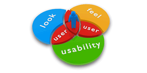
Web design is an important factor when having a website, blog or app. Designers are always pushing the envelope and trying new and exciting things. This is great, as long as they always keep the user in mind and how they are going to react to the site. Some designers get so caught up in the design, they forget about the most important factor when they get a visitor, and that is the accessibility and usability.
Icons and Hover Actions
One way to make things more clickable and easier to find is having an icon or small image next to the element. Most human beings are visual people and like to see what they are clicking. With that being said, if an image or icon will not work with what you are trying to accomplish, then makes sure you put some type of action on your clickable element. Either change the color, text decoration or animation.
![]()
Header Text
Most of your visitors are not going to read your website word for word. Even all that work you put into writing, people just aren’t going to read it. This sentence here will probably never be read. But by putting headers in-between your text paragraphs gives you a chance that your readers will scan and see something interesting and read more. Make sure your CSS makes the headers stand out from the rest of your text. Most common way is to increase your font weight and font size.
Search
If you don’t have a search on your site's interface, make sure you get one. You know how to navigate through your site, but others won’t. Having a search gives your users a way to find specific content on your site. Now that you have that covered, now make your search stands out. No reason to have a search if someone can’t find it on the page. Try to keep it above the fold and towards the top. This was been a proven best practice and has been converted time and time again.

Page Resolutions
When designing your page and other elements on your site, check to see what your most common browser resolution is. You can be easily tracked this in Google Analytics. If this is a brand new site and you don’t have any data on your audience’s browser resolution. In 2013 they most common resolution for a desktop computer is between 1024 x 768 and 1366 x 768. Anything above these widths runs the risk that your user will not see some right side elements.

Placement
The reason you design elements on your pages is to convert users. This could be reading certain information, newsletter signups or selling something. Make sure whatever your goal is on the page that you emphasize it. Same principle as other things talked about. Make it a different color, size and check the placement on the page.

Your placement on the page is the most important element, is doesn't matter how nice it looks if you have it at the bottom of the page. Time and time again most whitepapers studies show visitors looking in an "F" pattern. In result putting your converting elements in the top right of the page will bring the best results.
Balance which elements are more important than others, you don't want everything to be emphasized. Find the best one, optimize, and work your way around to the other elements.
 WebHostDesignPost

Comments (2)
What Do You Think?